Sunday, May 1, 2011

Summer Time = School is OUT and Internship!

I am one week away from being done with classes and then one week of finals! I am so close I can taste it, and its sweet. After a semester full of new experiences such as: putting together a polished resume that is for more than a waitress hosstess position (my first job), designing my portfolio to include both my architecture studio work and my interior design work, and job hunting for an internship! I worked so hard on each of these is hopes that it would lead to landing a summer internship not only an internship, but my dream internship at a firm in Dallas.

After some interviews I was offered a postion with Duncan Miller Ullmann in Dallas, TX which I happily accepted! So...this summer I will be working in an interior architecture firm which is exactly what I want to do after school!

I have nearly a month before I leave for Dallas but as school draws near to a finish the more my level of excitement goes up! I cant wait to work on real projects and especially the hospitaltiy projects, which are my favorite.

Here are a few of their projects!

Blue Frog | Macau, China | Dining


Zhouzhuang Resort | Zhouzhuang, China | Night Club


Hotel Zaza | Houstn, Texas | Lobby


10 things…ON THE WALL

...paint on the wall
We love painting walls, it helps make rooms in our homes different from one another and display our character. Solid walls of color can be great for accenting one wall over another or to just make an entire room more vibrant.


…stripes of paint on the wall
This is a nice alternative to plain walls. You had can add a little bit of pattern and excitement to the room or a lot!...depending on how big the strips are and how many you do.


…paper on the wall
Wall paper is wonderful to add pattern to a room! You can have wild and crazy patterns, or very soft and elegant. Even newspaper can be used on the walls like a wall paper!

…fabric boards on the wall
Fabric boards are my favorite to display pictures and drawings! I have multiple fabric boards in my room where I can easily change out pictures. Just choose a fabric that matches the scheme of the room and select a ribbon or two that coordinate with the fabic and wrap them around a stretcher from hobby lobby…so easy to make!

…chalkboard paint on the wall
Chalkboard paint I think is wonderful for children’s rooms and perhaps a cafĂ© where daily features change. For the childrens room they can draw on the wall which is what ever kid naturally wants to do, so why not allow them to in a way that also seconds as a wall treatment.

…frames on the wall
Frames on the wall allows beautiful photographs to be a focal point of a room. Many families take pride in photographs of trips and children and such therefore why not show them off as part of the design of the room! Frames can be coordinating or mixed matched, in a row or scattered, they look great any way!

…tiles on the wall
Tiles are usually thought of as square and sometimes as boring, but that doesn’t have to be the case! Tiles can be all shapes and colors, and the unique thing is you can mix and matched to make beautiful designs…and they design is unique displaying your own taste and character


Did you realize there were so many beautiful ways to treat walls!

Sunday, April 24, 2011

Folio Print Corps: Studio Project

I recently completed a studio project for a publishing compnay that published Art, Architecture, and Design books. For this project we had to dervive our concept basesd on the company's goals and objectives to have a more collaborative work environment and have a space that promotes printing books that will last a lifetime even in a world that is becoming more and more paperless. My concept was derived from both the company goals and the inspiration of the leaf. The leaf is symbolic to the pages of a book, the very item this company works to produce. The leaf inherently embodies the very design qualities this office is seeking for their space.

Here are my boards for the project, there are to be pinned up in a four square.


Concept, Rendered Floor Plan

The circulation paths reflect the stem and structure of the leaf. Also the VP offices are located along that path at the center of the workspace allowing for departments to be close in proximity to their respective VP office. 


Perspective of Reception, Perspective on Mezzanine Level, Sections


Perspective of a Collaborative Space, Perspective of the Breakroom and Kitchen,  Solution Statement


Section, Perspective of Exhibit from Mezzanine Level, Perspective of Informal Client Meeting Space 


Thursday, April 14, 2011

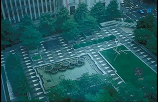
SPRING into Mellon Square Park

With SPRING having teased North West Arkansas about its arrival this year, the anticipation of consistent beautiful weather has had my mind occupied with thoughts of being outside and the experience of exterior spaces.  I have been trying to fully take in the experience of walking to and from classes, and taking more often trips to the mail box as an excuse to enjoy the sunshine on its rare occurrence in combination with warm weather.  While the desire to be outside by the pool during sunny weather was on my mind tonight, I was sitting inside during a rain storm listening to lectures for my landscape architecture class.  After about an hour of taking notes on the lecture, I found myself completely enthralled by the very last space discussed in the lecture. Mellon Square by John Simonds.
                        BEAUTY=  "perceived harmonious relationship of all the elements"
                                                                                                              -John O. Simonds
While watching the video that accompanied the lecture I was listening to, I realized how desperately I want to go to Pittsburg to experience this park.  Mellon Square Park is actually a space that I am now very interested in for many reasons.
FIRST. The park is located on the roof of a parking garage in the middle of the large city. The treatment of roofs with green space is of great interest to me lately as I am learning more and more about sustainable design. Also green roofs allow for green space to be given back to a city, where it was taken away by the constuction of the building or structure itself.


SECOND. Due to the space being on the roof it creates an “oasis” for escape in the middle of the city, as the design concept intended it to. This really excites me because of the decreasing amount of green space in cities as they grow and become more urban with tall buildings. The park allows for a place to retreat during ones lunch hour, but it also allows for a wonderful view for the inhabitants of the surrounding buildings; where as previously the space was a boring parking lot.


THIRD. The design is very modern! BUT it was actually designed in 1955. The space has such clean lines and simplicity, but in no way lacks detail. The detail comes in very unique treatments of water features, and the articulation of seating to create spaces.  And the treatment of the ground pavement that not only has symbolic meaning to the location of the park but also provides an energy to the space that accompanies views and sounds of flowing water.


Watch this video that got me so excited about Mellon Square Park to help you understand why I want to go to Pittsburg solely to be in this exquisite outdoor space.

Sunday, April 3, 2011

Designing with Concrete

Concrete can be a wonderful choice of material to design sinks, countertops, and bathtubs. One of the wonderful aspects of using conrete is the flexibility; the design can be as custom as you want therefore no one else will have the same thing as you. Any kind of shape can be formed, and changing the color is as easy as adding a die to the mix.After designing the sink you begin with making the formwork that will create the mold, wood is usually used to create the basic mold.

Custom sink designed by a friend and fellow students in the Architecture Design Build Program at the University of Arkansas. -This picture shows the placement of rebar after some concrete has been poured into the mold.

You also have to reinforce the structure with rebar and somesort of wiring, such as galvanized wire mesh. The use of these materials helps hold the structure in place, because movement can cause cracking. Also to avoid cracking you have to consider where to place expansion joints.  If the distance between joints is to great there is a higher chance for cracking. The mixture for concrete to build sinks, countertops, and bathtubs uses only about 20% cement and the rest is sand, aggregate, and water.

This picture shows the sink in complete form, yet before any sealers were put on.


Also the curing process is very important; the least amount of moisture the sturucture retains the strongeer it is. This is the drying out process but in order the keep the exterior from drying to fast and chipping or crumbling, you have to keep it moist. The curing process usually takes about 3-14 days depending on size and thickness. Finishing the structure is also very important for sanitation and longevity purposes. An apoxy and food sealer should be on structures for the kitchen or where food will be present. This will protect from particals and bacteria soaking into the concrete. Sealers also help keep the surfaces from being scrathced and chipped.

Here is the sink complete with sealers and installed in the bathroom of the house.

Concrete when built and constructed correctly can be the perfect solution to personal and design a sleek modern space.

Sunday, March 20, 2011

Trip to the Top!


I recently took a trip to St Louis where I had my second adventure to the Gateway Arch!  The first time I went two years ago I was so excited I didn’t pay much attention to detail and design. This time I had the luxury of taking a friend who had never been before so I got to do a lot of the explain of how things worked AND we both paid a LOT of attention to how things were designed and how joints and ends came together.

After tightly packed tram ride to the top of the arch, we viewed out over the city taking it all in, trying to find our hotel and such. BUT we both felt like we could feel the arch moving the whole time! So one of the biggest questions we both had about the entire experience was: Does the arch really sway?!  After some research I learned that the Arch does sway! Up to 9 inches in either direction in fact. Its designed to be resistant to wind up to 150MPH and earthquake resistant. This design feature is something that with the recent earthquake in Japan has become very important to a lot of people, having the security of knowing the building being designed will be able to survive and protect them during tragedy.
Another design feature that we both were in awe of and wanted to know more about was the exterior panels the arch is cladded with, and if the really narrowed as they went up or if it was just an illusion. Like with the swaying factor, I did some research when we got home about the structure of the building. The panels are 4x8  stainless steel, a skin covering that’s welded in place. The panels cover a carbon steal wall that’s reinforced with concrete in the middle, and this structure rises to 300ft, where it then turns in to solely the carbon steel all the way to the top.  And as for the whether, the panels actually get smaller or not, the legs do actually narrow from 54ft to 17 ft. And the height and with of the structure are the same at 360ft!

A little extra trivia about the beautiful arch: there is a time capsule located welded into the keystone. The capsule holds signatures of 762,000 students from the St. Louis area, and the capsule was placed in right before the last piece was set in place. Very cool!
Do any of you have any interesting facts about the arch, or things that you have wondered about?

Sunday, February 27, 2011

New Brunch at Copelands of New Orleans


As well as being a full time student I also work at Copeland’s of New Orleans Restaurant in Rogers, Arkansas. I have worked there for four years and it has been an amazing place to work. We have wonderful food, staff, and guests who dine with us! On Sunday mornings we have offered a brunch menu as well as our lunch and dinner menus; yet today we began something new and exciting! A buffet!
The new buffet will be every Sunday morning from 10am-3pm; which extends our previous brunch time by an hour. We still have our regular Brunch, Lunch, and Dinner menus but the buffet offers some new things to include: Prime Rib, Honey Spiral Ham, Boiled Shrimp (peel em and eat em), Breakfast Bar, Lunch Bar, Soups Salads and Dessert!
From a designer’s viewpoint I was very skeptical over the past few weeks about some key issues that arose when I found out we were adding the buffet on Sunday mornings. Not to spill the beans to the public but behind the scenes of all restaurants there are some things that become stressful when we are busy. The alarms sounded in my mind about circulation.  Traffic during the busy times with the additional traffic from people moving to and from the buffet and their seats is one of the main concerns I had. I know that during the original design of a space a certain percentage of square feet is added to an initial square footage to allow for circulation. Some spaces only need circulation for the employees but due to the space being used by both staff and guests the amount of space for circulation is increased. With the addition of the buffet to a restaurant design that only included space allotment for seating and circulation in the dining area, I was also concerned with where the food for the buffet would be placed.
As the day began this morning my concerns for how the buffet might cause issues were for the most part alleviated. The placement of the food in the dining room only minimally changed our table arrangements and actually forced us to open the banquet room to larger parties to allow for additional seating. There was certainly an increased amount of traffic from guests moving around the restaurant but on the side of the waitress/ waiter we were moving to and from the tables with plates less which helped keep congestion to a minimum. All in all guests seemed to enjoy the buffet very much. It allowed them to sample things and combine some breakfast items and some lunch items to create their meal.
I encourage each of you to come and try our new buffet on Sunday mornings. The experience is a higher class buffet combined with the wonderful Copeland’s atmosphere. Also check out the Copeland’s facebook page @ Copeland's Rogers Ar, to keep up with the happenings of our restaurant.

Sunday, February 20, 2011

VERDEVERTICAL


While working on my online portfolio last week I was doing a lot of looking around at other portfolios on carbonmade, the webcite I designed my portfolio with. I came across one portfolio of work done by the company VERDEVERTICAL. I went through every picture on their cite I was so inspired by it. Verdevertical is a factory in Mexico that specializes in vertical gardens! This company aims to create vertical gardens, or living walls, to provide the public the opportunity to be in contact with nature as much as possible.

 “Taking into account that the loss of green areas in the cities is a practically irreversible process, VERDEVERTICAL proposes to improve the environment, the quality of life and the urban landscape, through coating of nature in the constructed vertical surfaces” (found in the portfolio for the company)

Their goal is for their product to make an impact on “us”, the inhabitants of space, and that we will seek and desire to have more of our spaces designed with the services they are specialized in. Honestly everyone loves when winter ends, the sun begins to feel warm on our skin, and the grass and trees become green again.  Seeing plants and nature is symbolic of life and new growth and very energizing to the human spirit. Spring is the time that everyone seems to come alive again going about with a little more pep in their step. Imagine how it would be to have nature full and luscious in the middle of the city, no more having to leave for the country to find it. The idea of having more and more green space around us whether it is on the ground of the earth, the wall of a restaurant, or the roof of a building is inspiring!  
All of their pictures were copyrighted so I was unable to show anymore than what I did on my blog, but I highly encourage you to check out their portfolio at: http://verdevertical.carbonmade.com/. And get inspired!

Thursday, February 10, 2011

what I did on my 2nd snow day of this week

I made an ONLINE PORTFOLIO! I have been working on my digital portfolio and then came across a carbonmade portfolio and I was very inspired. I decided to put my other portfolio on the back burner and create this portfolio.  I still plan to add some things as I finish documenting. Take a look...and let me know what you think!

amartindesign.carbonmade.com

Tuesday, February 8, 2011

building a mission

In one of my classes we talked about goals and mission statements today. At first, when I read the chapter a few things grabbed my attention but I sort of blew off actually writting out my goals and mission statement like the book suggested. Then in class we were assigned to do so. Joke on me. BUT to my suprise when I sat down to write this tonight, it actually made me think a lot and I took it very seriously. I found that after jotting down some notes I felt inspired and had an uplifted attitude as I composed the sentences.

After doing some research on how to write one I learned that you should not write one over night. For the sake of the assignment I was required to, but now that i've found an interest in this I plan to keep up with it. Some of the tips said to keep it in a place where you can view it often to remind you of the things you are supposed to stand for and to remind you of what you once thought was important. Advice also suggested to revist your goals and statement every so often to update it and to see where you have come since your last written items.

Here is a quote from Stephen Covey's Community site that discusses goals and mission statements. Stephen Covey is the author of the popular book The Seven Habits of Highly Effective People, a book suggested by my text book for class that I am going to purchase and read for myself.


"Your mission statement becomes your constitution, the solid expression of your vision and values. It becomes the criterion by which you measure everything else in your life."


Here is my statement that I wrote tonight...

To steer myself down a path that I, and my family, can be proud of. To be hardworking and a leader to not only my friends, family, and coworkers, but to also be a positive influence on those I only meet in passing. To live with a thirst for knowledge, and the strength to resist temptation no matter the form it presents itself. And make decisions with both integrity and love, to therefore live without regret.

I advise those of you who have not written out goals in your life or a mission statement to do a little bit of research to get inspired and then to try writting some things for yourselves. 

Sunday, February 6, 2011

SNOW bright BUT not light :(

While being cooped up in my apartment over this last week of SNOW SNOW SNOW in Northwest Arkansas I have become extremely aware of how much light and lighting can affect one’s mood and productiveness. Usually when I am home it’s for lunch or at night near time for bed, but this week I had A LOT of spare time to do school work and reading. Yes I had a lot of time but as much as I wanted to, getting things done was next to impossible. In my apartment I have few sources of natural light; two windows, one in the bedroom and one in the living room. I also have few sources of artificial light; in the living room and kitchen there is only one overhead light/fan combo in each space and one small spot light over the sink. Trying to work in these conditions just put me in a dull lazy mood. There was very little light making me just want to go to sleep, even with the window open the amount of light coming in mid day is just not sufficient for reading or tasks.

My apartment kitchen-bad lighting.

“THE LIGHTING IN A WORKPLACE can influence the occupants in many ways. At the most basic level, the lighting will determine what can be seen and, hence, how quickly and easily visual work can be done. Lighting can also affect the occupants' health--in extreme cases through tissue damage, or, more generally, through eyestrain. It is important for the safety and health practitioner to be able to identify what constitutes good and bad lighting and to have some idea of how bad lighting might be made good.”  -Publication: Safety & Health Practitioner (The)

I have always known because I have been taught in school how important lighting is, but now I have conscientiously experienced the effects of it. One day last week we actually had school for a few hours in the morning. I had two classes and then because it started snowing again my third was cancelled. While I was at school I was energized and very motivated to work and get things done. The lighting in the class rooms were good, and the snow outside even provide a lot of light outside because of how reflective it was. After classes I came home and walking into my apartment felt like walking into a cave even with all the lights on. I began doing some school work and e-mails, soon to find myself just feeling so blah and wishing I was in the library where the is an abundance of light! I wish the lighting design in my apartment was as bright as the SNOW outside!
http://www.home-style-choices.com/home-lighting-design.html

The lighting in this kitchen is very adequate. It has some under cabinet lights very critical tasks, there is general lighting from the can lights in the ceiling, and there is ambient lighting via the pendants over the island.

What’s the lighting like at your home?

Sunday, January 30, 2011

punch of plum

The use of purples and plums in interiors has been on the rise! This color is rich like the favored color red but more flexible in its application. Red is a color of excitement that often raises the heart beat and triggers the want to eat, something that designers have to be careful about. With the right shade or tone of plum one can use this wonderful color in any setting.
This rich color can find its way into a space as formal as an elegant dining room at Moxie’s Classic Grill.

Nowambient.com

Or as tranquil as these bedrooms.  The simple use of the color as an accent.  Use for accent wall is dramatic and exciting, yet doing the entire room would be to dark and makes the space feel small.

Deluxe-interior.com


Homes-interior.com

Warm and relaxing, used with the right colors can be very contemporary especially shades of gray like in this living room.

Homedesignfind.com
 Also edgy and modern like in these kitchens.


Home-designing.com
Four years ago was the first time I remember experiencing the plum color when we moved into a new house and my mother used plum for the color of an accent wall! My whole family was in shock about the use of such a dramatic color and very unsure of how to feel about it, but my mother would say “trust me I know what I’m doing.”  A few years later I came to really like the design of this wall.
How do you feel about the color plum? Do you have plum in your office or home now?


Sunday, January 23, 2011

The Lights of Music!

Last night I had the pleasure of going to the Jason Aldean concert featuring the Jane Deer girls and Eric Church.  I love country music therefore was very excited about it.  If you’re not a fan of country you still might be interested in what caught my eye during the show, an aspect of design that I haven’t paid much attention to before.  As the concert progressed the show got more and more exciting. The music began with the Jane Deer girls, and then Eric church was really fun and got all of the super country guys riled up and excited.  And then with Jason Aldean the show had a change of pace from really “hick” country to a production. By this time everyone was completely enthralled with the show and singing along. Everything was in full swing! Lights! The lights and smoke were dramatic yet in perfect rhythm with the music. This amazed me!
Lighting is one aspect of design that I am most interested in, creating a mood or atmosphere for the setting. I also have a passion for music and the talent of those who play the instruments. With that said I have been to rock concerts before where the lights and smoke were dramatic, fast, and exciting, but I have never noticed or taken the time to pay attention to how they conduct the light show.  At least at the concert last night while I was recording a few of the songs I really noticed that the lights flashed and moved along to the beats and feel of the song.  After I had realized this I felt more connected to the show, I appreciated how the smaller details were taken into consideration to make the experience of the show more enjoyable to the customer.
I wanted to post one of the videos for you to watch; even if you don’t like country music you can watch the lighting and see how design can play a role in this career field. Toward the end of this video is the most dramatic part of the lighting and production, see if you can catch on to how the lights and rhythm are in sync.  Please excuse how much the camera is moving, I too was enjoying the show and got caught up dancing and moving to the music as well.

Here is the link: